
Climate change is one of the world’s most pressing challenges. Human emissions of greenhouse gases – carbon dioxide (CO2), nitrous oxide, methane, and others – have increased global temperatures by around 1℃ since pre-industrial times.1
A changing climate has a range of potential ecological, physical and health impacts, including extreme weather events (such as floods, droughts, storms, and heatwaves); sea-level rise; altered crop growth; and disrupted water systems. The most extensive source of analysis on the potential impacts of climatic change can be found in the 5th Intergovernmental Panel on Climate Change (IPCC) report.2
To mitigate climate change, UN member parties have set a target, in the Paris Agreement, of limiting average warming to 2℃ above pre-industrial temperatures.
Summary
|
Global warming to date
Temperature increase
Global average temperature has increased by more than one degree celsius since pre-industrial times.
To set the scene, let’s look at how the planet has warmed. In the chart we see the global average temperature relative to the average of the period between 1961 and 1990.
The red line represents the average annual temperature trend through time, with upper and lower confidence intervals shown in light grey.
We see that over the last few decades, global temperatures have risen sharply — to approximately 0.7℃ higher than our 1961-1990 baseline. When extended back to 1850, we see that temperatures then were a further 0.4℃ colder than they were in our baseline. Overall, this would amount to an average temperature rise of 1.1℃.
Because there are small year-to-year fluctuations in temperature, the specific temperature increase depends on what year we assume to be ‘pre-industrial’ and the end year we’re measuring from. But overall, this temperature rise is in the range of 1 to 1.2℃.
In this chart you can also view these changes by hemisphere (North and South), as well as the tropics (defined as 30 degrees above and below the equator). This shows us that the temperature increase in the North Hemisphere is higher, at closer to 1.4℃ since 1850, and less in the Southern Hemisphere (closer to 0.8℃). Evidence suggests that this distribution is strongly related to ocean circulation patterns (notably the North Atlantic Oscillation) which has resulted in greater warming in the northern hemisphere.3.
CO2 in the atmosphere
CO2 concentrations in the atmosphere are at their highest levels in over 800,000 years.
This rise in global average temperature is attributed to an increase in greenhouse gas emissions.4 This link between global temperatures and greenhouse gas concentrations – especially CO2 – has been true throughout Earth’s history.5
In the chart here we see global average concentrations of CO2 in the atmosphere over the past 800,000 years. Over this period we see consistent fluctuations in CO2 concentrations; these periods of rising and falling CO2 coincide with the onset of ice ages (low CO2) and interglacials (high CO2).6 These periodic fluctuations are caused by changes in the Earth’s orbit around the sun – called Milankovitch cycles.
Over this long period, atmospheric concentrations of CO2 did not exceed 300 parts per million (ppm). This changed with the Industrial Revolution and the rise of human emissions of CO2 from burning fossil fuels. We see a rapid rise in global CO2 concentrations over the past few centuries, and in recent decades in particular. For the first time in over 800,000 years, concentrations did not only rise above 300ppm but are now well over 400ppm.
How much of the warming since 1850 can be attributed to human emissions? Almost all of it: aerosols have played a slight cooling role in global climate, and natural variability has played a very minor role. This article from the Carbon Brief, with interactive graphics showing the relative contributions of different forcings on the climate, explains this very well.
How have global CO2 emissions changed over time?
The visualisation presents the long-run perspective on global CO2 emissions. Global emissions increased from 2 billion tonnes of carbon dioxide in 1900 to over 36 billion tonnes 115 years later.
What do our most recent trends in emissions and concentrations look like? Are we making any progress in reduction?
Whilst data from 2014 to 2017 suggested global annual emissions of CO2 had approximately stabilized, data from the Global Carbon Project reported a further annual increase of 2.7%, and 0.6% in 2018 and 2019, respectively.
Per capita CO2 emissions
Where in the world does the average person emit the most carbon dioxide (CO2) each year?
We can calculate the contribution of the average citizen of each country by dividing its total emissions by its population. This gives us CO2 emissions per capita. In the visualization we see the differences in per capita emissions across the world.
Here we look at production-based emissions – that is, emissions produced within a country’s boundaries without accounting for how goods are traded across the world. In our post on consumption-based emissions we look at how these figures change when we account for trade.
Production figures matter – these are the numbers that are taken into account for climate targets7 – and thanks to historical reconstructions they are available for the entire world since the mid 18th century.
There are very large inequalities in per capita emissions across the world.
The world’s largest per capita CO2 emitters are the major oil producing countries; this is particularly true for those with relatively low population size. Most are in the Middle East: In 2017 Qatar had the highest emissions at 49 tonnes (t) per person, followed by Trinidad and Tobago (30t); Kuwait (25t); United Arab Emirates (25t); Brunei (24t); Bahrain (23t) and Saudi Arabia (19t).
However, many of the major oil producers have a relatively small population meaning their total annual emissions are low. More populous countries with some of the highest per capita emissions – and therefore high total emissions – are the United States, Australia, and Canada. Australia has an average per capita footprint of 17 tonnes, followed by the US at 16.2 tonnes, and Canada at 15.6 tonnes.
This is more than 3 times higher than the global average, which in 2017 was 4.8 tonnes per person.
Since there is such a strong relationship between income and per capita CO2 emissions, we’d expect this to be the case: that countries with high standards of living would have a high carbon footprint. But what becomes clear is that there can be large differences in per capita emissions, even between countries with similar standards of living. Many countries across Europe, for example, have much lower emissions than the US, Canada or Australia.
In fact, some European countries have emissions not far from the global average: In 2017 emissions in Portugal are 5.3 tonnes; 5.5t in France; and 5.8t per person in the UK. This is also much lower than some of their neighbours with similar standards of living, such as Germany, the Netherlands, or Belgium. The choice of energy sources plays a key role here: in the UK, Portugal and France, a much higher share of electricity is produced from nuclear and renewable sources – you can explore this electricity mix by country here. This means a much lower share of electricity is produced from fossil fuels: in 2015, only 6% of France’s electricity came from fossil fuels, compared to 55% in Germany.
Prosperity is a primary driver of CO2 emissions, but clearly policy and technological choices make a difference.
Many countries in the world still have very low per capita CO2 emissions. In many of the poorest countries in Sub-Saharan Africa – such as Chad, Niger and the Central African Republic – the average footprint is around 0.1 tonnes per year. That’s more than 160 times lower than the USA, Australia and Canada. In just 2.3 days the average American or Australian emits as much as the average Malian or Nigerien in a year.
This inequality in emissions across the world I explored in more detail in my post, ‘Who emits more than their share of CO2 emissions?’
Annual CO2 emissions
Who emits the most CO2 each year? In the treemap visualization we show annual CO2 emissions by country, and aggregated by region. Treemaps are used to compare entities (such as countries or regions) in relation to others, and relative to the total. Here each inner rectangle represents a country – which are then nested and colored by region. The size of each rectangle corresponds to its annual CO2 emissions in 2017. Combined, all rectangles represent the global total.
The emissions shown here relate to the country where CO2 is produced (i.e.production-based CO2) , not to where the goods and services that generate emissions are finally consumed. We look at the difference in each country’s production vs. consumption (trade-adjusted) emissions here.
Asia is by far the largest emitter, accounting for 53% of global emissions. As it is home to 60% of the world’s population this means that per capita emissions in Asia are slightly lower than the world average, however.
China is, by a significant margin, Asia’s and the world’s largest emitter: it emits nearly 10 billion tonnes each year, more than one-quarter of global emissions.
North America – dominated by the USA – is the second largest regional emitter at 18% of global emissions. It’s followed closely by Europe with 17%. Here we have grouped the 28 countries of the European Union together, since they typically negotiate and set targets as a collective body. You can see the data for individual EU countries in the interactive maps which follow.
Africa and South America are both fairly small emitters: accounting for 3-4% of global emissions each. Both have emissions almost equal in size to international aviation and shipping. Both aviation and shipping are not included in national or regional emissions. This is because of disagreement over how emissions which cross country borders should be allocated: do they belong to the country of departure, or country of origin? How are connecting flights accounted for? The tensions in reaching international aviation and shipping deals are discussed in detail at the Carbon Brief here.
 |
| LARGE IMAGE |
The same data is also explorable by country and over time in the interactive map.
By clicking on any country you can see how its annual emissions have changed, and compare it with other countries.
Share of global CO2 emissions by country
In the interactive chart you can explore each country’s share of global emissions. Using the timeline at the bottom of the map, you can see how the global distribution has changed since 1751. By clicking on any country you can see its evolution and compare it with others.
If you’re interested in which countries emit more or less than their ‘fair share’ based on their share of global population, you can explore this here.
The distribution of emissions has changed significantly over time. The UK was – until 1888, when it was overtaken by the US – the world’s largest emitter. This was because the UK was the first country to industrialize, a transition which later contributed to in massive improvements in living standards for much of its population.
Whilst rising CO2 emissions have clear negative environmental consequences, it is also true that they have historically been a by-product of positive improvements in human living conditions. But, it’s also true that reducing CO2 emissions is important to protect the living conditions of future generations. This perspective – that we must consider both the environmental and human welfare implications of emissions – is important if we are to build a future that is both sustainable and provides high standards of living for everyone.
Rising emissions and living standards in North America and Oceania followed soon after developments in the UK.
Many of the world’s largest emitters today are in Asia. However, Asia’s rapid rise in emissions has only occurred in very recent decades. This too has been a by-product of massive improvements in living standards: since 1950 life expectancy in Asia has increased from 41 to 74 years; it has seen a dramatic fall in extreme poverty; and for the first time most of its population received formal education.
Whilst all countries must work collectively, action from the very top emitters will be essential. China, the USA and the 28 countries of the EU account for more than half of global emissions. Without commitment from these largest emitters, the world will not come close to meeting its global targets.
Cumulative CO2 emissions
Since 1751 the world has emitted over 1.5 trillion tonnes of CO2.8 To reach our climate goal of limiting average temperature rise to 2°C, the world needs to urgently reduce emissions. One common argument is that those countries which have added most to the CO2 in our atmosphere – contributing most to the problem today – should take on the greatest responsibility in tackling it.
We can compare each country’s total contribution to global emissions by looking at cumulative CO2. We can calculate cumulative emissions by adding up each country’s annual CO2 emissions over time. We did this calculation for each country and region over the period from 1751 through to 2017.9
The distribution of cumulative emissions around the world is shown in the treemap. Treemaps are used to compare entities (such as countries or regions) in relation to others, and relative to the total. Here countries are presented as rectangles and colored by region. The size of each rectangle corresponds to the sum of CO2 emissions from a country between 1751 and 2017. Combined, all rectangles represent the global total.
There are some key points we can learn from this perspective:
- the United States has emitted more CO2 than any other country to date: at around 400 billion tonnes since 1751, it is responsible for 25% of historical emissions;
- this is twice more than China – the world’s second largest national contributor;
- the 28 countries of the European Union (EU-28) – which are grouped together here as they typically negotiate and set targets on a collaborative basis – is also a large historical contributor at 22%;
- many of the large annual emitters today – such as India and Brazil – are not large contributors in a historical context;
- Africa’s regional contribution – relative to its population size – has been very small. This is the result of very low per capita emissions – both historically and currently.
 |
| LARGE IMAGE |
How has each region’s share of global cumulative CO2 emissions changed over time?
In the visualizations above we focused on each country or region’s total cumulative emissions (1) in absolute terms; and (2) at a single point in time: as of 2017.
In the chart we see the change in the share of global cumulative emissions by region over time – from 1751 through to 2017.
Up until 1950, more than half of historical CO2 emissions were emitted by Europe. The vast majority of European emissions back then were emitted by the United Kingdom; as the data shows, until 1882 more than half of the world’s cumulative emissions came from the UK alone.
Over the century which followed, industrialization in the USA rapidly increased its contribution.
It’s only over the past 50 years that growth in South America, Asia and Africa have increased these regions’ share of total contribution.
How has each country’s share of global cumulative CO2 emissions changed over time?
In the final visualization you can explore the same cumulative CO2 emissions as you have seen above but now visualizes by country. Using the timeline at the bottom of the chart you can see how contribution across the world has evolved since 1751. By clicking on a country you can see an individual country’s cumulative contribution over time.
The map for 2017 shows the large inequalities of contribution across the world that the first treemap visualization has shown. The USA has emitted most to date: more than a quarter of all historical CO2: twice that of China which is the second largest contributor. In contrast, most countries across Africa have been responsible for less than 0.01% of all emissions over the last 266 years.
What becomes clear when we look at emissions across the world today is that the countries with the highest emissions over history are not always the biggest emitters today. The UK, for example, was responsible for only 1% of global emissions in 2017. Reductions here will have a relatively small impact on emissions at the global level – or at least fall far short of the scale of change we need. This creates tension with the argument that the largest contributors in the past should be those doing most to reduce emissions today. This is because a large fraction of CO2 remains in the atmosphere for hundreds of years once emitted.10
This inequality is one of the main reasons which makes international agreement on who should take action so challenging.
Consumption-based (trade-adjusted) CO2 emissions
CO2 emissions are typically measured on the basis of ‘production’. This accounting method – which is sometimes referred to as ‘territorial’ emissions – is used when countries report their emissions, and set targets domestically and internationally.11
In addition to the commonly reported production-based emissions statisticians also calculate ‘consumption-based’ emissions. These emissions are adjusted for trade. To calculate consumption-based emissions we need to track which goods are traded across the world, and whenever a good was imported we need to include all CO2 emissions that were emitted in the production of that good, and vice versa to subtract all CO2 emissions that were emitted in the production of goods that were exported.
Consumption-based emissions reflect the consumption and lifestyle choices of a country’s citizens.
Which countries in the world are net importers of emissions and which are net exporters?
In the interactive map we see the emissions of traded goods. To give a perspective on the importance of trade these emissions are put in relation to the country’s domestic, production-based emissions.12
- Countries shown in red are net importers of emissions – they import more CO2 embedded in goods than they export.
For example, the USA has a value of 7.7% meaning its net import of CO2 is equivalent to 7.7% of its domestic emissions. This means emissions calculated on the basis of ‘consumption’ are 7.7% higher than their emissions based on production.
- Countries shown in blue are net exporters of emissions – they export more CO2 embedded in goods than they import.
For example, China’s value of -14% means its net export of CO2 is equivalent to 14% of its domestic emissions. The consumption-based emissions of China are 14% lower than their production-based emissions.
You can find these figures in absolute (tonnes of CO2) and per capita terms for each country in the Additional Information section.
How do consumption-based emissions compare to production-based emissions?
How did the differences between a country’s production and consumption-based emissions change over time?
In the interactive charts you can compare production- and consumption-based emissions for many countries and world regions since the first data is available in 1990.13 One chart shows total annual emissions, the other one shows the same on a per capita basis. Using the ‘change country’ toggle of the chart you can switch between them.
Individual maps of consumption-based annual and per capita emissions can also be found in the Additional Information which follows this post.
We see that the consumption-based emissions of the US are higher than production: In 2016 the two values were 5.7 billion versus 5.3 billion tonnes – a difference of 8%. This tells us that more CO2 is emitted in the production of the goods that Americans import than in those products Americans export.
The opposite is true for China: its consumption-based emissions are 14% lower than its production-based emissions. On a per capita basis, the respective measures are 6.9 and 6.2 tonnes per person in 2016. A difference, but smaller than what many expect.
Whilst China is a large CO2 emissions exporter, it is no longer a large emitter because it produces goods for the rest of the world. This was the case in the past, but today, even adjusted for trade, China now has a per capita footprint higher than the global average (which is 4.8 tonnes per capita in 2017). In the Additional Information you find an interactive map of how consumption-based emissions per capita vary across the world.
These comparisons provide the answer to the question whether countries have only achieved emissions reductions by offshoring emissions intensive production to other countries. If only production-based emissions were falling whilst consumption-based emissions were rising, this would suggest it was ‘offshoring’ emissions elsewhere.
There are some countries where this is the case. Examples where production-based emissions have stagnated whilst consumption-based CO2 steadily increased include Ireland in the early 2000s; Norway in the late 1990s and early 2000s; and Switzerland since 1990.
On the other hand there are several very rich countries where both production- and consumption-based emissions have declined. This has been true, among others, for the UK (chart), France (chart), Germany (chart), and the USA (chart). These countries have achieved some genuine reductions without outsourcing the emissions to other countries. Emissions are still too high in all of these countries, but it shows that genuine reductions are possible.
In most countries emissions increased when countries become richer, but this is also not necessarily the case: by comparing the change in consumption-based emissions and economic growth we see that many countries have become much richer while achieving a reduction of emissions.
CO2 emissions by fuel
Carbon dioxide emissions associated with energy and industrial production can come from a range of fuel types. The contribution of each of these sources has changed significantly through time, and still shows large differences by region. In the chart we see the absolute and relative contribution of CO2 emissions by source, differentiated between gas, liquid (i.e. oil), solid (coal and biomass), flaring, and cement production.
At a global level we see that early industrialisation was dominated by the use of solid fuel—this is best observed by switching to the ‘relative’ view in the chart. Coal-fired power at an industrial-scale was the first to emerge in Europe and North America during the 1700s. It wasn’t until the late 1800s that we begin to see a growth in emissions from oil and gas production. Another century passed before emissions from flaring and cement production began. In the present day, solid and liquid fuel dominate, although contributions from gas production are also notable. Cement and flaring at the global level remain comparably small.
You can also view these trends across global regions in the chart by clicking on ‘change region’. The trends vary significantly by region. Overall patterns across Europe and North America are similar: early industrialisation began through solid fuel consumption, however, through time this energy mix has diversified. Today, CO2 emissions are spread fairly equally between coal, oil and gas. In contrast, Latin America and the Caribbean’s emissions have historically been and remain a product of liquid fuel—even in the early stages of development coal consumption was small.15
Asia’s energy remains dominant in solid fuel consumption, and has notably higher cement contributions relative to other regions.16
Africa also has more notable emissions from cement and flaring; however, its key sources of emissions are a diverse mix between solid, liquid and gas.
Global inequalities in CO2 emissions
Global inequalities by production
There are two parameters that determine our collective carbon dioxide (CO2) emissions: the number of people, and quantity emitted per person. We either talk about total annual or per capita emissions. They tell very different stories and this often results in confrontation over who can really make an impact: rich countries with high per capita emissions, or those with a large population.
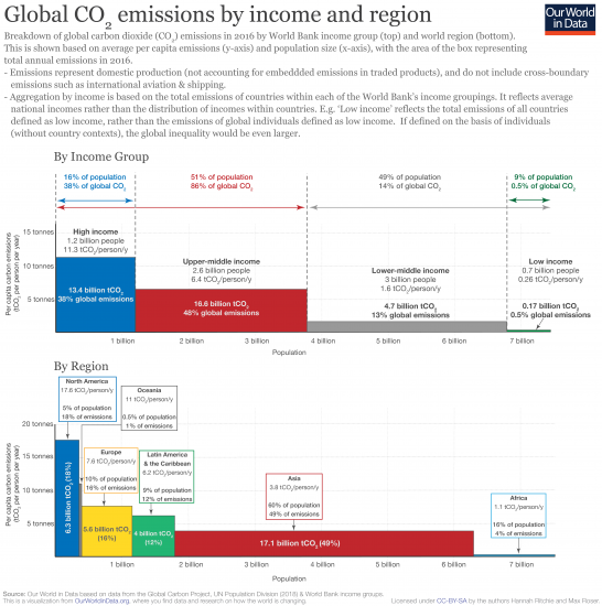
To help us understand the global distribution of per capita emissions and population, we have visualized global CO2 emissions by (1) World Bank income group and (2) by world region.
The world’s total CO2 emissions17 are shown on the basis of two axes: the height of the bar (y-axis) is the average per capita CO2 emissions and the length of the box (x-axis) is the total population. Since total emissions are equal to per capita emissions multiplied by the number of people, the area of each box represents total emissions.18
Emissions by country’s income
When aggregated in terms of income, we see in the visualization that the richest half (high and upper-middle income countries) emit 86 percent of global CO2 emissions. The bottom half (low and lower-middle income) only 14%. The very poorest countries (home to 9 percent of the global population) are responsible for just 0.5 percent. This provides a strong indication of the relative sensitivity of global emissions to income versus population. Even several billion additional people in low-income countries — where fertility rates and population growth is already highest — would leave global emissions almost unchanged. 3 or 4 billion low income individuals would only account for a few percent of global CO2. At the other end of the distribution however, adding only one billion high income individuals would increase global emissions by almost one-third.19
Note here that the summary by income is on the basis of country income groupings, rather than that of individuals. For example, ‘low income’ is the total emissions of all countries defined as low income, rather than the lowest income individuals in the world. These figures therefore don’t take account of inequalities in emissions within countries. It’s estimated that within-country inequalities in emissions can be as large as those between countries.20
If we were to calculate this distribution by the income of individuals, rather than countries, we’d see that the global inequalities in emissions would be even greater. The richest of the global population would be responsible for an even larger share of global emissions.
Emissions by world region
When aggregated by region we see that North America, Oceania, Europe, and Latin America have disproportionately high emissions relative to their population. North America is home to only five percent of the world population but emits nearly 18 percent of CO2 (almost four times as much). Asia and Africa are underrepresented in emissions. Asia is home to 60 percent of the population but emits just 49 percent; Africa has 16 percent of the population but emits just 4 percent of CO2. This is reflected in per capita emissions; the average North American is more than 17 times higher than the average African.
This inequality in global emissions lies at the heart of why international agreement on climate change has (and continues to be) so contentious. The richest countries of the world are home to half of the world population, and emit 86 percent of CO2 emissions. We want global incomes and living standards — especially of those in the poorest half — to rise. To do so whilst limiting climate change, it’s clear that we must shrink the emissions of high-income lifestyles. Finding the compatible pathway for levelling this inequality is one of the greatest challenges of this century.
 |
| LARGE IMAGE |
Global inequalities by consumption
The initial comparison of emissions by income group and region was based on ‘territorial’ emissions (those emitted within a country’s borders) — these are termed ‘production-based’ and are the metrics by which emissions are commonly reported. However, these emissions do not account for traded goods (for which CO2 was emitted for their production). If a country is a large importer of goods its production-based emissions would underestimate the emissions required to support its standard of living. Conversely, if a country is a large goods exporter, it includes emissions within its accounts which are ultimately exported for use or consumption elsewhere.
‘Consumption-based’ emissions correct for this by adjusting for trade. Consumption-based emissions are therefore: (production-based emissions – embedded CO2 in exported goods + embedded CO2 in imported goods). The Global Carbon Project (GCP) publishes estimates of these adjustments in their carbon budget.21 You can find much more information and data on emissions in trade in our full entry here.
How do consumption-based emissions change the emission shares by income group and region? In the table I compare each group’s share of the world population, production- and consumption-based CO2 emissions.
On a production basis we had previously found that the richest (high and upper-middle income) countries in the world accounted for half of the population but 86 percent of emissions.22 On a consumption basis we find the same result, but resulting from the fact that upper-middle income countries primarily export emissions to high income countries. High income countries’ collective emissions increase from 39 to 46 percent when adjusted for trade (with only 16 percent of the population); upper-middle income countries’ emissions decrease by the same amount (7 percentage points) from 48 to 41 percent. Overall, this balances out in the top half of the world population: upper-middle income countries are net exporters whilst high income net importers.
In the bottom half, it appears that very little changes for the collective of lower-middle and low income countries: their production and consumption emissions shares are effectively the same.
By region we see that traded emissions tend to flow from Asia to North America and Europe (Asia’s share reduces when adjusted for trade whilst North America and Europe’s share increases).
Note here that consumption-based emissions are not available for all countries. Collectively, countries without consumption-based estimates due to poor data availability account for approximately 3 percent of global emissions. Many of the missing countries are at low and lower-middle incomes. With the addition of these countries, we would expect small percentage point shifts across the distribution. The challenges in accounting for carbon embedded in global trade23 mean these estimates are not perfect; nonetheless they should provide a good approximation of the global transfers across the world.
On a consumption basis, high-income countries (Europe and North America in particular) account for an even larger share of global emissions (46 percent — nearly three times their population share of 16 percent).

Other greenhouse gas emissions
Previous charts in this article focused on emissions of carbon dioxide. But carbon dioxide is not the only greenhouse gas There are a range of greenhouse gases, which include methane, nitrous oxide, and a range of smaller concentration trace gases such as the so-called group of ‘F-gases’.
This chart shows total greenhouse gas emissions – measured in tonnes of ‘carbon dioxide-equivalents’.
Global warming potential of greenhouse gases
Carbon dioxide is not the only greenhouse gas. There are a range of greenhouse gases, which include methane, nitrous oxide, and a range of smaller concentration trace gases such as the so-called group of ‘F-gases’.
Greenhouse gases vary in their relative contributions to global warming; i.e. one tonne of methane does not have the same impact on warming as one tonne of carbon dioxide. We define these differences using a metric called ‘Global Warming Potential’ (GWP). GWP can be defined on a range of time-periods, however the most commonly used (and that adopted by the IPCC) is the 100-year timescale (GWP100).24
In the chart we see the GWP100 value of key greenhouse gases relative to carbon dioxide. The GWP100 metric measures the relative warming impact one molecule or unit mass of a greenhouse gas relative to carbon dioxide over a 100-year timescale. For example, one tonne of methane would have 28 times the warming impact of tonne of carbon dioxide over a 100-year period. GWP100 values are used to combine greenhouse gases into a single metric of emissions called carbon dioxide equivalents (CO2e). CO2e is derived by multiplying the mass of emissions of a specific greenhouse gas by its equivalent GWP100 factor. The sum of all gases in their CO2e form provide a measure of total greenhouse gas emissions.
Methane emissions
This interactive shows methane (CH₄) emissions across the world.
Methane emissions are measured in tonnes of carbon dioxide equivalent (CO2e), so are weighted for its 100-year global warming potential value.
Nitrous oxide emissions
This interactive shows nitrous oxide (N2O) emissions across the world.
Nitrous oxide emissions are measured in tonnes of carbon dioxide equivalent (CO2e), so are weighted for its 100-year global warming potential value.
Emissions by sector
Global greenhouse gas emissions are broken down by sectoral sources in the sections which follow (showing carbon dioxide, methane and nitrous oxide individually, as well as collectively as total greenhouse gas terms). This data is based on UN reported figures, sourced from the EDGAR database. Sources define sectoral emissions groupings in the following way25:
- Energy (energy, manufacturing and construction industries and fugitive emissions): emissions are inclusive of public heat and electricity production; other energy industries; fugitive emissions from solid fuels, oil and gas, manufacturing industries and construction.
- Transport: domestic aviation, road transportation, rail transportation, domestic navigation, other transportation.
- International bunkers: international aviation; international navigation/shipping.
- Residential, commercial, institutional and AFF: Residential and other sectors.
- Industry (industrial processes and product use): production of minerals, chemicals, metals, pulp/paper/food/drink, halocarbons, refrigeration and air conditioning; aerosols and solvents; semicondutor/electronics manufacture; electrical equipment.
- Waste: solid waste disposal; wastewater handling; waste incineration; other waste handling.
- Agriculture: methane and nitrous oxide emissions from enteric fermentation; manure management; rice cultivation; synthetic fertilizers; manure applied to soils; manure left on pasture; crop residues; burning crop residues, savanna and cultivation of organic soils.
- Land use: emissions from the net conversion of forest; cropland; grassland and burning biomass for agriculture or other uses.
- Other sources: fossil fuel fires; indirect nitrous oxide from non-agricultural NOx and ammonia; other anthropogenic sources.
Methane (CH₄) emissions by sector
Carbon dioxide (CO2) emissions by sector
Nitrous oxide (N2O) emissions by sector
Future emissions
Future emissions scenarios
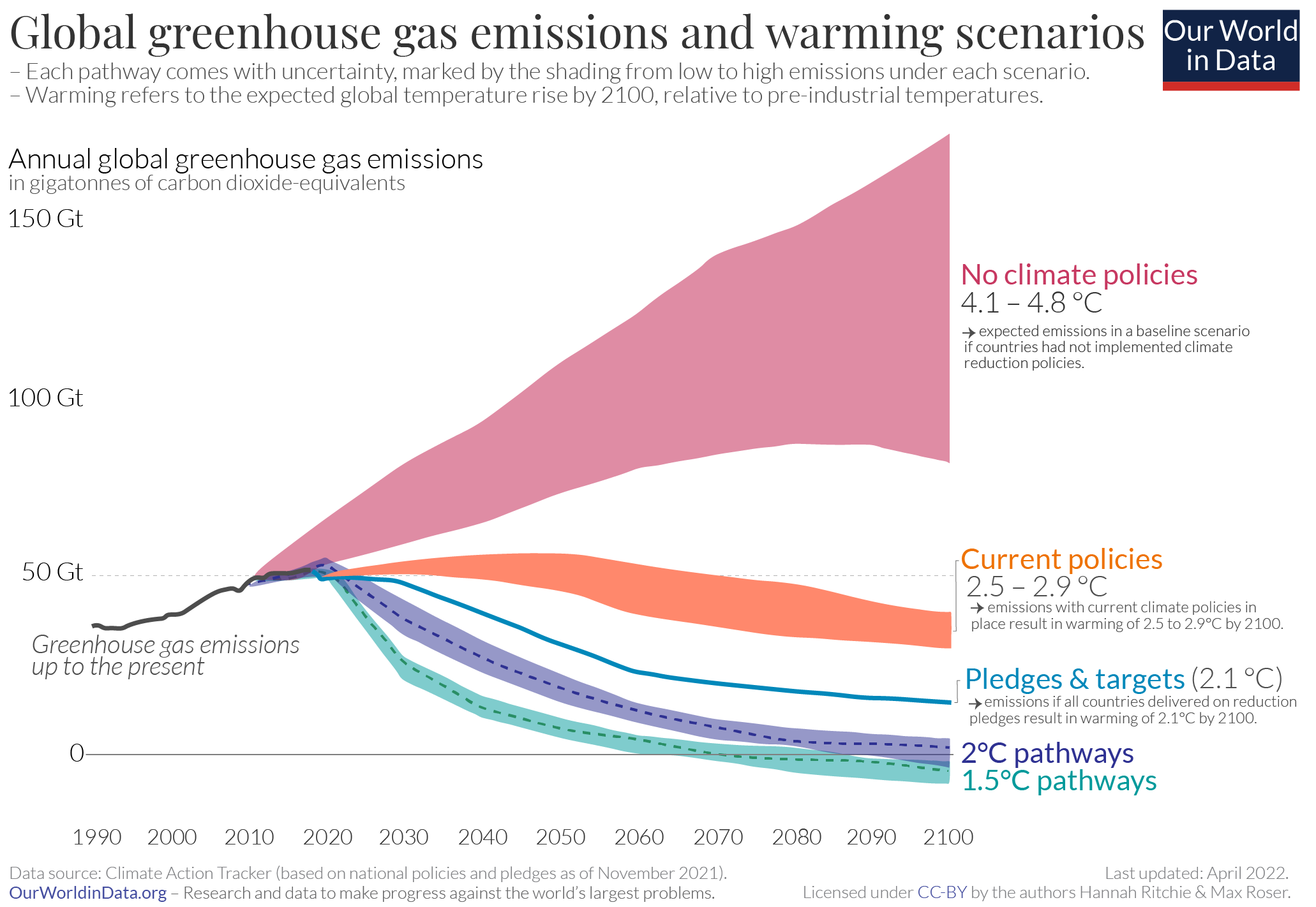
What does the future of our carbon dioxide and greenhouse gas emissions look like. In the visualization we show a range of potential future scenarios of global greenhouse gas emissions (measured in gigatonnes of carbon dioxide equivalents), based on data from Climate Action Tracker. Interactive data of these pathways can be found here. Here, five scenarios are shown:
- No climate policies: projected future emissions if no climate policies were implemented; this would result in an estimated 4.1-4.8°C warming by 2100 (relative to pre-industrial temperatures)
- Current climate policies: projected warming of 3.1-3.7°C by 2100 based on current implemented climate policies
- National pledges: if all countries achieve their current targets/pledges set within the Paris climate agreement, it’s estimated average warming by 2100 will be 2.6-3.2°C. This will go well beyond the overall target of the Paris Agreement to keep warming “well below 2°C”.
- 2°C consistent: there are a range of emissions pathways that would be compatible with limiting average warming to 2°C by 2100. This would require a significant increase in ambition of the current pledges within the Paris Agreement.
- 1.5°C consistent: there are a range of emissions pathways that would be compatible with limiting average warming to 1.5°C by 2100. However, all would require a very urgent and rapid reduction in global greenhouse gas emissions.
 |
| LARGE IMAGE |
What would it take to limit global average temperature rise to 1.5°C?
Robbie Andrew, senior researcher at the Center for International Climate Research (CICERO), mapped out the global emissions reduction scenarios necessary to limit global average warming to 1.5°C. Robbie Andrew’s description of this work, visualizations and open-access data is available here.
These ‘mitigation curves’ are based on the carbon budget outlined in the IPCC’s Special Report on 1.5°C and the methodology for converting a cumulative carbon budget into annual quotas from Michael Raupach, publish in Nature Climate Change.26,27 These mitigation curves are based on the assumption of zero negative emissions (actively removing CO2 from the atmosphere).
The visualization here shows the range of mitigation curves necessary to have a >66% chance of limiting warming to 1.5°C. We first see global emissions to date – sourced from the Global Carbon Project – shown in black. Then, shown are the range of mitigation curves which would be necessary if mitigation (here meaning a near-immediate peak in global emissions then reduction) started in any given year. For example, the curve ‘Start in 2005’ shows the necessary emissions curve if mitigation had started in 2005.
What becomes clear is that the later the peak in emissions, the steeper the curve: the longer we wait, the more rapid emissions reductions need to be.
If emissions had peaked around 2000, for example, global emissions would have had to fall at an average of around 3% per year. As of 2019, we can only emit around 340Gt CO2 before we exceed the 1.5°C budget – this is equal to around 8 years of current emissions.28,29 If we peaked emissions today, we would have to reduce emissions by around 15% each year through to 2040 to limiting warming to 1.5°C without negative emissions technologies.
2°C emissions pathways
In the section above we looked at the emissions reductions necessary to limit warming to 1.5°C. How does this change when we extend the carbon budget to one which limits warming to 2°C?
Robbie Andrew, senior researcher at the Center for International Climate Research (CICERO) also mapped out the mitigation curves for a 2°C target.30
In the visualization we see the various emissions scenarios to achieve 2°C depending on the year that global emissions peak.
We see that the same principle applies as for 1.5°C: the later we wait to peak global emissions, the more drastic reductions will need to be.
As explained by Zeke Hausfather in the Carbon Brief, if we’d started global mitigation in 2000, the required rate of reduction would have been around 1 to 2% per year. If we peaked emissions in 2019 it would require reductions of 4 to 5% every year to limit warming to 2°C without negative emissions technologies.
Atmospheric GHG concentrations
CO2 concentrations
The large growth in global CO2 emissions has had a significant impact on the concentrations of CO2 in Earth’s atmosphere. If we look at atmospheric concentrations over the past 2000 years (see the Data Quality and Measurement section in this entry for explanation on how we estimate historical emissions), we see that levels were fairly stable at 270-285 parts per million (ppm) until the 18th century. Since the Industrial Revolution, global CO2 concentrations have been increasing rapidly.
If we look even longer-term – greater than 800,000 years into the past – we see that today’s concentrations are the highest they’ve been for at least 800,000 years.31 The cycles of peaks and troughs in CO2 concentrations track the cycles of ice ages (low CO2) and warmer interglacials (higher CO2). CO2 concentrations did not exceed 300ppm throughout these cycles – today it is well over 400ppm.
Atmospheric concentrations continue to rise, as shown here. Atmospheric concentrations have now broken the 400ppm threshold—considered its highest level in the last three million years. To begin to stabilise—or even reduce—atmospheric CO2 concentrations, our emissions need to not only stabilise but also decrease significantly.
Even if the world achieved a stabilization in CO2 emissions, this would not translate into the same for atmospheric concentrations. This is because CO2 accumulates in the atmosphere based on what we call a ‘residence time’. Residence time is the time required for emitted CO2 to be removed from the atmosphere through natural processes in Earth’s carbon cycle. The length of this time can vary—some CO2 is removed in less than 5 years through fast cycling processes, meanwhile other processes, such as absorption through land vegetation, soils and cycling into the deep ocean can take hundreds to thousands of years. If we stopped emitting CO2 today, it would take several hundred years before the majority of human emissions were removed from the atmosphere.32
CH4 concentrations
N2O concentrations
CO2 emissions and prosperity
Historically, CO2 emissions have been primarily driven by increasing fuel consumption. This energy driver has been, and continues to be, a fundamental pillar of economic growth and poverty alleviation. As a result, we see in the visualization that there is a strong correlation between per capita CO2 emissions and GDP per capita.
This correlation is also present over time: Countries begin in the bottom-left of the chart at low CO2 and low GDP, and move upwards and to the right. Historically, where fossil fuels are the dominant form of energy, we therefore see increased CO2 emissions as an unintended consequence of development and economic prosperity.
While we see this general relationship between CO2 and GDP, there are outliers in this correlation, and important differences exist in the rate with which per capita emissions have been growing.
These differences are exemplified in global inequalities in energy provision, CO2 emissions, and economic disparities. In the chart we see the change in CO2 emissions (i.e. the growth rates) over the last few decades (1998-2013) across the global spectrum of emitters.
On the x-axis we have the spectrum of global emitters (where those at the far left have very low per capita emissions, and those at the far right have the world’s highest per capita emissions). On the y-axis we have the growth (in %) in CO2 emissions that each segment of emitters has undergone from 1998-2013. We see that the middle of the spectrum—typically those near the middle of the global income spectrum—have experienced a large growth in CO2 emissions over the last few decades (most between 25-40%). Insofar as emissions are a correlate of development, this is good news and reflects the fact that a global middle class is developing, but it does present important challenges in terms of global CO2 emissions.
It is therefore concerning that at the bottom of the spectrum (the group of people of whom many are part of the world’s poorer population) have seen a 12% decline in CO2 emissions over this same period. While a decline in emissions is necessary and possible for individuals with high per capita emissions, for the poorest, this potentially suggests stagnation or decline in living conditions.
Not only cross-country inequalities in CO2 emissions are important—there are also noticeable within-country inequalities. In fact, as the global inequalities in CO2 emissions between countries begin to converge, within-country inequalities become more important. As the chart here shows, in 1998 two-thirds of inequality in CO2 emissions were due to between-country differences. Within-country differences then became more important, and by 2013, within and between-country differences were responsible for roughly the same share of total inequalities.
Growth rate in CO2 emissions (from 1998-2013) across the spectrum of global emitters33

Levels of CO2 inequality between and within countries34

CO2 and poverty alleviation
The link between economic growth and CO2 described above raises an important question: do we actually want the emissions of low-income countries to grow despite trying to reduce global emissions? In our historical and current energy system (which has been primarily built on fossil fuels), CO2 emissions have been an almost unavoidable consequence of the energy access necessary for development and poverty alleviation.
In the two charts we see per capita CO2 emissions, and energy use per capita (both on the y-axes), plotted against the share of the population living in extreme poverty (%) on the x-axis. In general, we see a very similar correlation in both CO2 and energy: higher emissions and energy access are correlated to lower levels of extreme poverty. Energy access is therefore an essential component in improved living standards and poverty alleviation.35
In an ideal world, this energy could be provided through 100% renewable energy: in such a world, CO2 emissions could be an avoidable consequence of development. However, currently we would expect that some of this energy access will have to come from fossil fuel consumption (although potentially with a higher mix of renewables than older industrial economies). Therefore, although the global challenge is to reduce emissions, some growth in per capita emissions from the world’s poorest countries remains a sign of progress in terms of changing living conditions and poverty alleviation.
CO2 intensity of economies
If economic growth is historically linked to growing CO2 emissions, why do countries have differing levels of per capita CO2 emissions despite having similar GDP per capita levels? These differences are captured by the differences in the CO2 intensity of economies; CO2 intensity measures the amount of CO2 emitted per unit of GDP (kgCO2 per int-$). There are two key variables which can affect the CO2 intensity of an economy:
- Energy efficiency: the amount of energy needed for one unit of GDP output. This is often related to productivity and technology efficiency, but can also be related to the type of economic activity underpinning output. If a country’s economy transitions from manufacturing to service-based output, less energy is needed in production, therefore less energy is used per unit of GDP.
- Carbon efficiency: the amount of CO2 emitted per unit energy (grams of CO2 emitted per kilowatt-hour). This is largely related to a country’s energy mix. An economy powered by coal-fired energy will produce higher CO2 emissions per unit of energy versus an energy system with a high percentage of renewable energy. As economies increase their share of renewable capacity, efficiency improves and the amount of CO2 emitted per unit energy falls.
This is likely thanks to both improved energy and technology efficiency, and increases in the capacity of renewables.37
The carbon intensity of nearly all national economies has also fallen in recent decades. Today, we see the highest intensities in Asia, Eastern Europe, and South Africa. This is likely to be a compounded effect of coal-dominated energy systems and heavily industrialized economies. The shift in industrial production from high-income to transitioning economies, and its impact on CO2 emissions, is discussed in the next section.
CO2 intensity and prosperity
As seen in the section above, the general trend in carbon intensity at the global and national level is a downward trend over time. But how do levels of CO2 intensity change across different levels of prosperity?
In the chart we have plotted average carbon intensities by country (y-axis) against gross domestic product (GDP) per capita (x-axis, log scale). As a cross-section across countries in any given year, we see an overall shape akin to an inverted-U. On average, we see low carbon intensities at low incomes; carbon intensity rises as countries transition from low-to-middle incomes, especially in rapidly growing industrial economies; and as countries move towards higher incomes, carbon intensity falls again.
This trend is approximately true as a cross-section across countries. However, such trends differ for individual countries over time. If we view these trends over the timeline from 1990 onwards we see that there are large variations in the evolution of carbon intensities, even for countries with similar income levels.
The cost of global CO2 mitigation
With an understanding of the link between CO2 and global temperatures, as well as knowledge of the sources of emissions, an obvious question arises: How much could we reduce our emissions by, and how much would it cost? The possible cost-benefit of taking global and regional action on climate change is often a major influencing factor on the effectiveness of mitigation agreements and measures. How we work out the potential costs of global climate change mitigation has been covered in an explainer post here.
Definitions & Measurement
How do we reconstruct long-term CO2 concentrations?
In more recent years, global concentrations of CO2 can be measured directly in the atmosphere using instrumentation sensor technology. The longest and most well-known records from direct CO2 measurement comes from the Mauna Loa Observatory (MLO) in Hawaii. The MLO has been measuring atmospheric composition since the 1950s, providing the clearest record of CO2 concentrations across the 20th and 21st century.
To reconstruct long-term CO2 concentrations, we have to rely on a number of geological and chemical analogues which record changes in atmospheric composition through time. The process of ice-coring allows for the longest extension of historical CO2 records, extending back 800,000 years. The most famous ice core used for historical reconstructions is the Vostok Ice Core in Antarctica. This core extends back 420,000 years and covers four glacial-interglacial periods.
Ice cores provide a preserved record of atmospheric compositions—with each layer representing a date further back in time. These can extend as deep at 3km. Ice cores preserve tiny bubbles of air which provide a snapshot of the atmospheric composition of a given period. Using chemical dating techniques (such as isotopic dating) researchers relate time periods to depths through an ice core. If Looking at the Vostok Ice Core, researchers can say that the section of core 500m deep was formed approximately 30,000 years ago. CO2 concentration sensors can then be used to measure the concentration in air bubbles at 500m depth—this was approximately 190 parts per million. Combining these two methods, researchers estimate that 30,000 years ago, the CO2 concentration was 190ppm. Repeating this process across a range of depths, the change through time in these concentrations can be reconstructed.
How do we measure or estimate CO2 emissions?
Historical fossil fuel CO2 emissions can be reconstructed back to 1751 based on energy statistics. These reconstructions detail the production quantities of various forms of fossil fuels (coal, brown coal, peat and crude oil), which when combined with trade data on imports and exports, allow for national-level reconstructions of fossil fuel production and resultant CO2 emissions. More recent energy statistics are sourced from the UN Statistical Office, which compiles data from official national statistical publications and annual questionnaires. Data on cement production and gas flaring can also be sourced from UN data, supplemented by data from the US Department of Interior Geological Survey (USGS) and US Department of Energy Information Administration. A full description of data acquisition and original sources can be found at the Carbon Dioxide Information Analysis Center (CDIAC).
As an example: how do we estimate Canada’s CO2 emissions in 1900? Let’s look at the steps involved in this estimation.
- Step 1: we gather industrial data on how much coal, brown coal, peat and crude oil Canada extracted in 1900. This tells us how much energy it could produce if it used all of this domestically.
- Step 2: we cannot assume that Canada only used fuels produced domestically—it might have imported some fuel, or exported it elsewhere. To find out how much Canada actually burned domestically, we therefore have to correct for this trade. If we take its domestic production (account for any fuel it stores as stocks), add any fuel it imported, and subtract any fuel it exported, we have an estimate of its net consumption in 1900. In other words, if we calculate: Coal extraction − Coal exported + Coal imported − Coal stored as stocks, we can estimate the amount of coal Canada burned in 1900.
- Step 3: converting energy produced to CO2 emissions. we know, based on the quality of coal, its carbon content and how much CO2 would be emitted for every kilogram burned (i.e. its emission factor). Multiplying the quantity of coal burned by its emission factor, we can estimate Canada’s CO2 emissions from coal in 1900.
- Step 4: doing this calculation for all fuel types, we can calculate Canada’s total emissions in 1900.
There are two key ways uncertainties can be introduced: the reporting of energy consumption, and the assumption of emissions factors (i.e. the carbon content) used for fuel burning. Since energy consumption is strongly related to economic and trade figures (which are typically monitored closely), uncertainties are typically low for energy reporting. Uncertainty can be introduced in the assumptions nations make on the correct CO2 emission factor for certain fuel types.
Country size and the level of uncertainty in these calculations have a significant influence on the inaccuracy of our global emissions figures. In the most extreme example to date, Lui et al. (2015) revealed that China overestimated its annual emissions in 2013 by using global average emission factors, rather than specific figures for the carbon content of its domestic coal supply.39
As the world’s largest CO2 emitter, this inaccuracy had a significant impact on global emissions estimates, resulting in a 10% overestimation. More typically, uncertainty in global CO2 emissions ranges between 2-5%.40
Links
No comments :
Post a Comment